gardening flyers and business cards

I have recently completed my first commissioned work! I was asked to design some business cards and flyers for a gentleman who has recently started up a gardening company. This was a super big deal for me as it is my first paid job since finishing university which is pretty cool.

The client was really happy with the designs and I have been given the all clear to print them which will be really good for building up my commissioned portfolio.

Here was the designed flyer and the business card.

flyer

busniness card

Hay festival project evaluation

Hay Festival Project Evaluation

For this project, I was asked to produce something to be given out as part of promotion for a play called The Little Black Fish, which is being performed by students at the college. I originally had the idea of making an activity sheet along with a print that I could just give away at the production of the page for children to get involved with. However, as this was more of a side project, I had to time manage and focus more on my major project, so in the end, I just did the print and didn’t do the activity sheet like I had planned.

Things that went well

I did enjoy the research of this project, as I got to learn about the story which is one I had never heard before. I also liked that I was able to try and improve on a technique that I have previously done, and I think the print actually came out very well. I liked the fact that I was able to experiment with colour, and also using negative space. I did a rough copy of the print and a final cope, and because of the paper I used, it has made the fish look like there are more scales within the image. I think it will work really well as a hand out, but I would consider reducing the size, or maybe putting it a postcard which I think might look nice.

I liked getting to meet new people, and to learn about what other courses are doing, and to feel like I could collaborate with a project from another course. We did this with our blacksmith zines, and I thought that project worked very well as well.

Things that could have been improved

I think the main issue I had with this project was the time. As I was doing my major project at the same time, I did find it hard with the time management, and I couldn’t do all of what I wanted to do which was slightly disappointing. I think I could have been a lot more resourceful and could have tried to organise myself better in order to get the most potential out of the project.

I think more contact with the leader of the course would have been good, but again due to time constraints, this wasn’t always possible.

I feel like I did overstretch myself a little bit by taking on this project as well, which is a life lesson I will keep not to overdo myself.

If I was to redo the project

If I did get the chance to redo the project, which i could do after the assessment for the hay festival still, I would work on getting my activity sheet together, and try out some different processes. I have also been working digitally a lot lately so it would be nice to try and incorporate this into the activity sheet, using the style I have found through doing my other project.

There isn’t really much at this stage I can do for an evaluation for this project as I have focused more on the other two, which will have a more in depth evaluation.

Cook book project evaluation

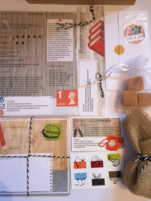
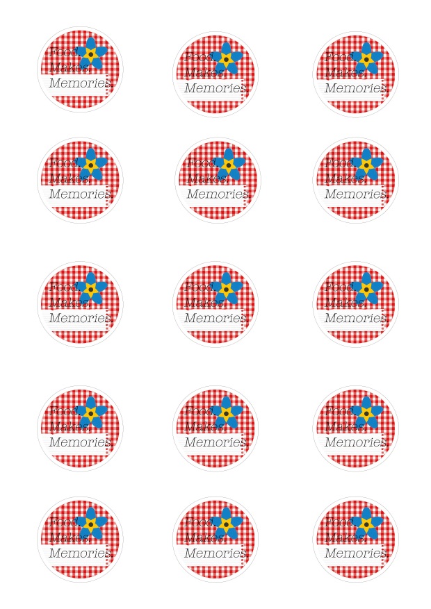
Cook Book Project Evaluation

For my major project, I decided to create a cook book, as I want to focus on lifestyle illustration. However, I wanted to combine the cook book with another lifestyle factor which was mental health, particularly dementia. Working at a dementia care home, I began collecting recipes from the residents I work with, and hearing all of the narrative stories behind them. My cook book almost acts as a guide for cooking, but also a story book about the residents at my home, kind of like an autobiography kind of thing. I wanted to try and emphasise the link between memory and food.

Things that went well

I really enjoyed the research for this project. It enabled me to really get to know the residents I work with, and to create a holistic project about something that is personal to me. Helping people with this illness on a daily basis, it was nice to be able to link my career as an artist, and as a carer, which I hopefully plan to do later on in life. This project really enabled me to come out of my comfort zone and improve on a new skill, and I have improved on my Photoshop skills greatly. I was also able to find a style that really works for me, and that is contemporary in the illustration world.

I think the design works really well, it combines multiple mediums form collage, to photography, to illustration. The design is bold and sophisticated, and highlights the interesting facts about the residents well.

My time management for this project was really good, and I managed to respond to feedback very well and in a good time. I did gain a lot of feedback and I took everything on board and tried to work in all of the improvements I was given. I also think I worked well with the tutors, and managed to get into the studio a lot more this time round which was really useful and helpful. The communication between my tutors and I was good, and this really did enable me to produce a quick turnaround.

The final product looks really professional and bold, is easily read and the colours look great. I did pay to get it printed but I also managed to help out at the printers, and learnt some new skills with printing which could come in handy for later about the pagination of pages etc.

Things that could have been improved

If there was one thing I would have likes to improved on, I would have probably added in more recipes, as I only did 18. To do 25-30 would have been ideal, but with the time frame I had, I didn’t see this as possible.

I also would have liked to have got into the project a lot quicker than I did. I did spend a lot of time changing the design, and at one point I pretty much started again with the design. But I think all of the changes paid off, and this was another valuable professional lesson that you will have to have quick turnarounds after feedback, which I thought I coped with very well.

I could have also added a few more of the small illustrations in to the book, and although I wanted to make the book look professional, a little bit more of a scrapbook style could have worked well. But I am happy with the outcome of the book. I could have also done some paper based designs do help with deciding on the layout and played around with composition.

If I was to redo the project

 I would have like to have worked with more of the residents at the home, and I would have also looked down the route of getting the book published. I would also play around with the design a bit more, adding in more detail, but this would be something that would depend on the time constraints. I would also again look at doing a larger number of recipes, and I would possibly have changed the book shape to a square shape, as opposed to the standard A4, but this size did work really well for printing.

Promo pack completion

Here is the completed content of the promo packs I have been working on.

IMG_1394

Inside of the packs, I have put a CV, a cover letter, a business card, recipe cards with 6 in total, a book mark, a badge, stickers, and seeds and toffee fudge, ingredients from two of the recipes I have produced. I have tried to keep all of the design similar and the similar colour scheme. I think the pack works really well, and I have packaged it all in a paper bag, like an old styled grocery bag. I was going to do a zine, but because of time constraints, I haven’t been able to, but I am happy with everything I have produced.

Promotional materials evaluation

Promotional Materials Evaluation

To accompany my major project, I also had to do some promotional materials as a way of promoting myself as an illustrator. We had to make a CV, and a covering letter, and a choice of 5 promotional materials. So these could range from business cards, to stickers, badges, zines, bookmarks, etc. So I did a CV with a creative side and a plain side for professions. I did a covering letter, and for my 5 promotional materials, I chose to do a business card, a book mark, badges, stickers and I made recipe cards. I also added in little extra touches like seeds, and a sweet as my project is based around cooking, so I put some of the ingredients in there. I made little promo packs to go with the books that I will be selling, and then I have extra business cards just to give out.

Things that went well

I think the overall theme of the project worked really well. I tried to stick as close to the same design as possible without having everything the same. And I tried to use a similar process to what I used when doing my cook book. I like the size of everything and it works well as a collective pack, it is something I can use to advertise my book with which essentially is what the packs are for. I have added in extra bits within the pack, which makes it different and potentially stand out to potential clients. The packs are easy to reproduce and aren’t very costly to make which is good.

The colours I have used have been neutral with one main colour running throughout which is red. I also did some spot colour on the stickers and on the recipe cards, and have added in small illustrations which I have taken from the cook book, to make that direct link, and to give an insight to what the cook book displays.

The pack is very functional, as this is something I wanted to achieve as I think something useful is going to be paid more attention than something that isn’t so useful. I also wanted to make the pack portable and works as a pack, but also works individually, and I believe I have managed to accomplish this.

Things that could have been improved

I think I could have added in a few more small illustrations into the design, and could have experimented with the design. The business card does have a small typo as the printers had printed the wrong copy, but I think I would just put that down to a life experience, it is only minor. I think this also shows the importance of proof reading everything, which is something I have really learnt to do throughout this whole project, and my cooking project.

I could have possibly changed the size of my CV so I could have included more information, but I wanted to keep it short, easy to read and to the point, which is why I did do a smaller size to limit the amount of text. I could have also linked my stickers a little bit more with my other promotional materials so it would work more as a pack. But with Marion’s help, I managed to make it fit a bit more in with everything else.

I also could have time managed a bit better, and could have started the promotional materials sooner than I did, but i=with other deadlines and work commitments, I did struggle with the time management.

If I was to redo the project

I would have also done the zine I planned to do, if I had more time, as I feel like this would be a really good way to tell my story about the journey of my illustration. I also would have liked to have looked more into physical items, and tailored it more to cooking. I did the recipe cards and book mark for the book, but maybe I could have looked into ceramics or textiles which could link in with the cooking illustration and more lifestyle illustration that I mainly work in. Overall though, I feel like this area of the project went really well, and I would like to expand on the promotional things I could put in my pack to show my illustration more.

Recipe cards

I have been working on my recipe cards that will also be going in my promo packs. I have made them interactive, so people can actually use them to write their own recipes, but have designed them in my style.

I decided to add in the spot colours to the pages, so they would match with my stickers. I will post about my stickers then they arrive, and I am still working on my book cards and my zine that will go with the packs.

Cover letter

I have written a cover letter that I will include in the packs. I plan to fold the letter in a traditional letter style, and am yet to decide whether to use an envelop or a seal to close the letter.
Screen Shot 2018-05-15 at 13.38.58

Once I have finished each of the individual elements to the park, I will make up a task and take some photos to show the completed pack.

Badge design

I have also been working on a badge design for badges to go in with my packs. I had to do the badge 38mm, but had to leave a 4mm bleed around the edge, so I did this by creating a cut line I could follow. I have done 3 badge designs, which I will decide on which ones to use.

I think I am going to use the red badge, as after some feedback, Marion suggested uses red as a main colour, and then the colours on the stickers as spot colour to go on my zine. So I think the red will be more appropriate.  Also, the checkered red and white is like a picnic blanket style, which works well with the food idea.

And I wanted to produce 15 badges, so I created badge sheets I could print the whole lot off at one with.

page of badges


Final print

So I finally got round to printing my lino cut print and here are the results. I did a first print to remove the excess ink off the lino mat, but I actually thought it looked quite good. It enhanced the look of scales on the print.

Screen Shot 2018-05-19 at 14.00.29

I then did the full version print.

Screen Shot 2018-05-19 at 14.00.15

I rea;;y liked how this one came pit. I considered adding in some spot colour, but decided to leave it black and white as it will be cheaper to reproduce in black and white. I still plan to use them as prints to give out at the hay festival, although I was thinking about doing them A5 size.

I would have liked to have done a zine of the project, but with the time i have left i don’t think it will be possible. But I still have something that can be used as advertisement of the play.